web ui / ux
Clarisonic’s Site Navigation Redesign.
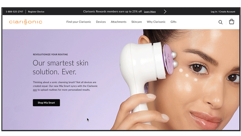
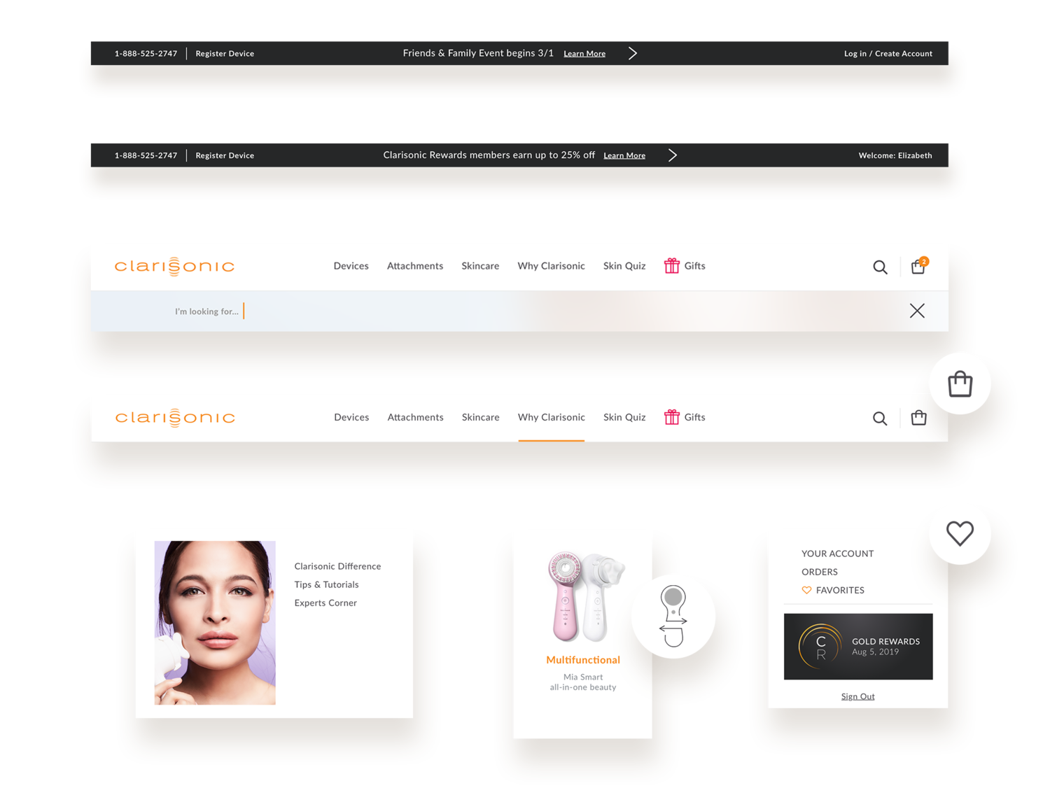
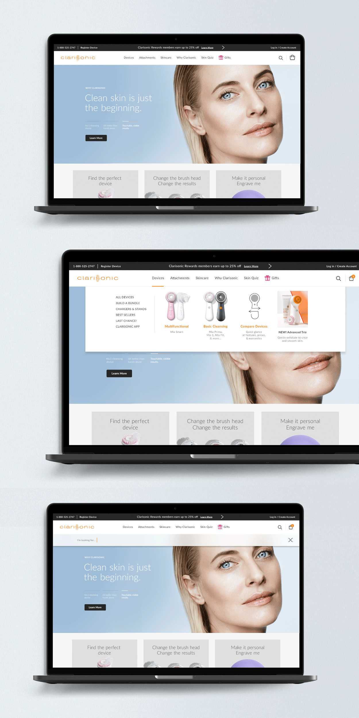
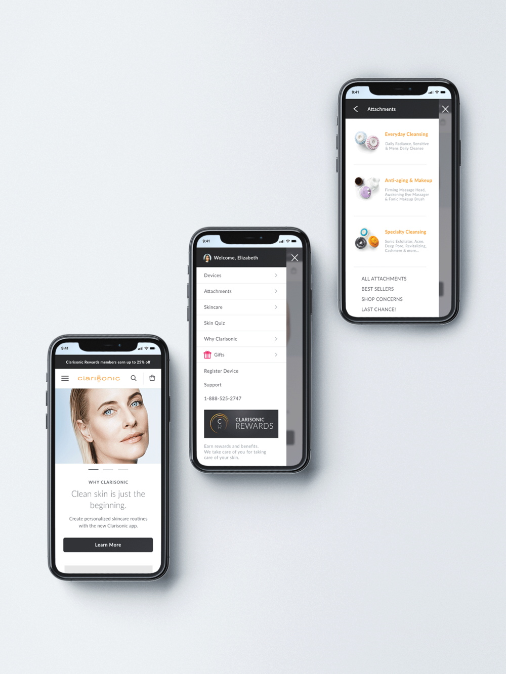
When Clarisonic redesigned it’s ecommerce site in 2017, it was launched with new art direction, an education focused strategy and modern shopping experience. The digital team then set focus to the sites’ navigation, which needed a total overhaul from taxonomy to design. Structured heavily around SEO, it lacked scalability, consumer-friendly categorization and organization.
role
UX/UI Designer
Creative Manager
credits
Clarisonic Ecom
L’Oréal D2C
Sapient

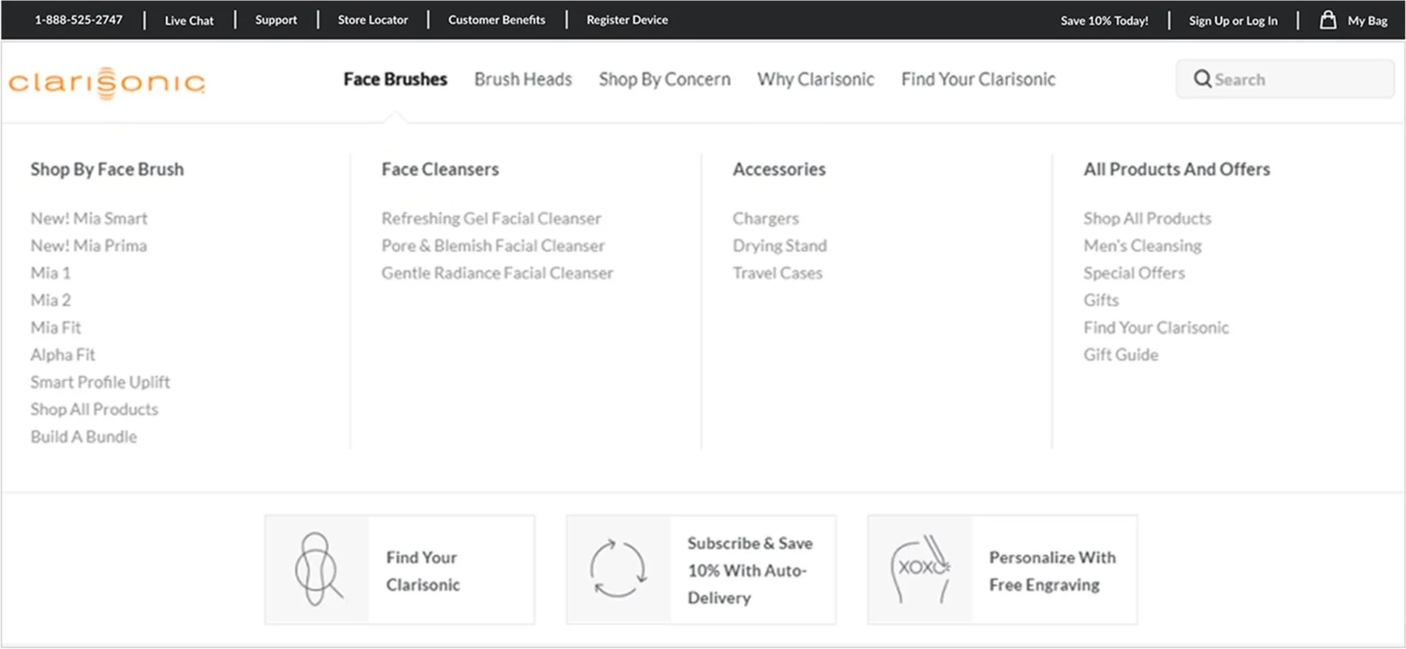
So, what is the actual problem?
With the teams priority set on new users, a large portion of Clarisonic’s daily visits, the ecommerce team asked if it’s “mega nav” was truly set up for discovery and education. Does a consumer understand the position of products based on first level categories, as well as second level? Can they immediately tell the difference between a face brush and a brush head?
To find out, I partnered with Loreals’ direct to consumer and digital optimization teams for a deep dive into the menu and its usage metrics.
User testing.
We found that nomenclature was a common confusion when users were navigating the menu. They often clicked on the wrong category. Friction was common when users were tasked with finding products by use-case (e.g you are concerned with wrinkles, find a product that would work best for you).
The metrics.
When looking at the data from Clarisonic.com, we found redundancies – many caused confusion and clutter, as well as unnecessarily splitting traffic. With three categories controlling much of (~50% desktop/mobile) traffic, it was apparent some sub-categories were either superfluous, misclassified, or undiscoverable.
Defining the scope.
Restructure information architecture and remove redundancies. Improving the experience for their first-time visitors.
Organize navigation to allow for product discovery. Establishing product guidance vs. product name overload.
Improve visual language and micro interactions. Enhancing visual cues and usability.
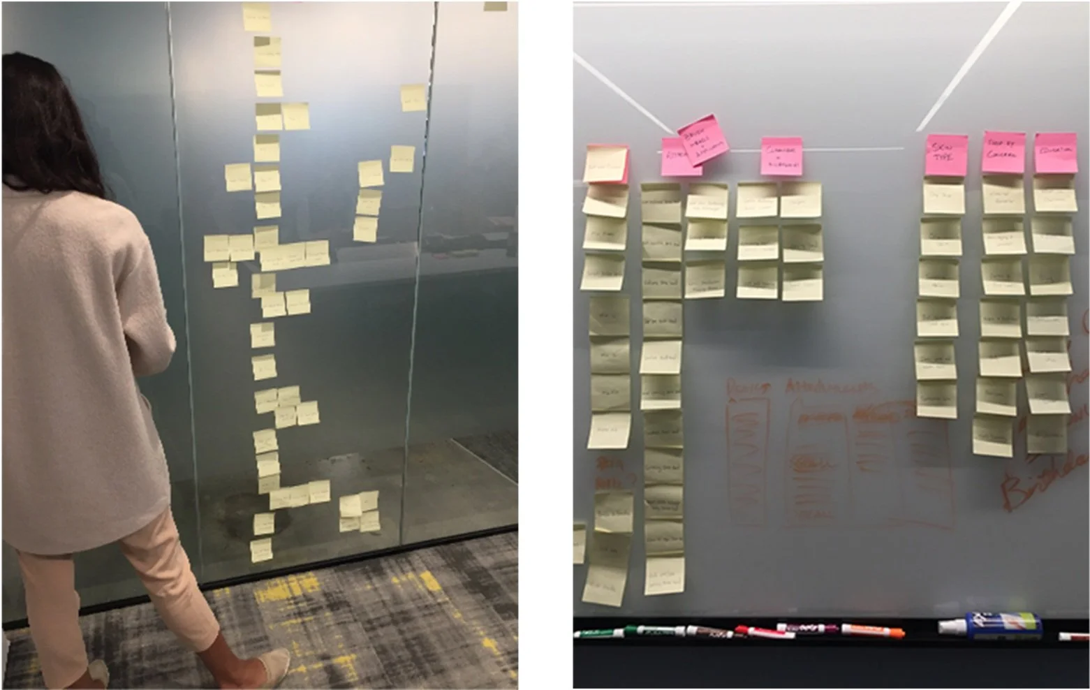
Team workshops and sitemap.
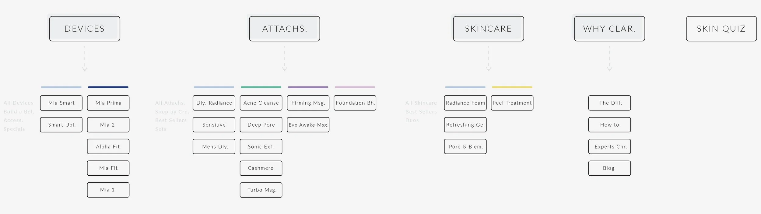
I facilitated a workshop with cross-functional partners to better understand how people grouped products, define redundancies, and find shared perspectives on category naming.
I took the category concepts and created a model of how the menu could be structured. The visualization was instrumental to check-ins with stakeholders, collaboration with DTC and development—pushing early discussion on dev and seo implications.


Market analysis and visual research.
I proceeded with market analysis so that we could explore visual ideas. Cross-functional discussion helped level set design, motion, and flow intention.
I researched ecommerce menus, from both apparel and skincare commerce sites. Captureing a good mix of information architecture from similar industries. I documented common ui elements and micro interactions that would support discussions at the next stage.
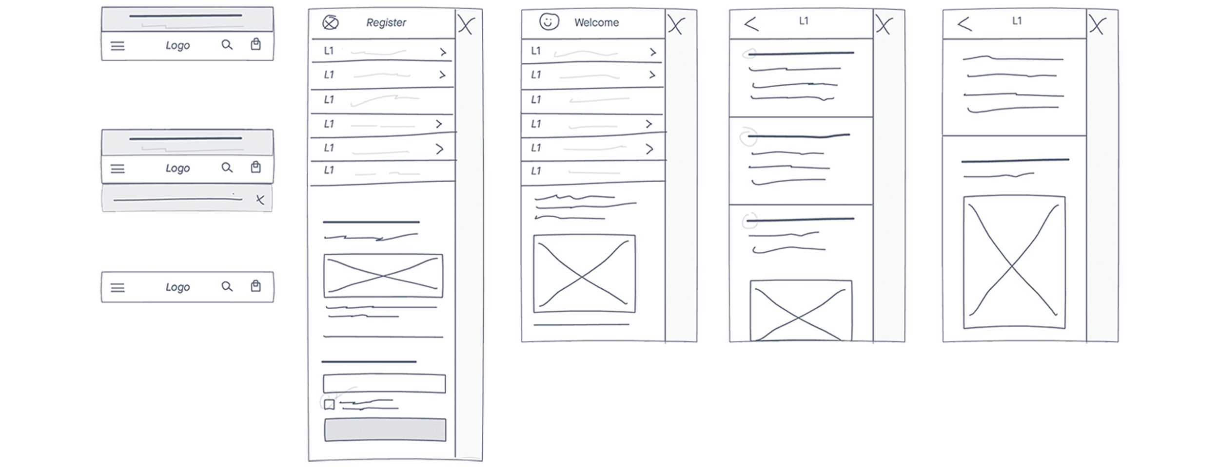
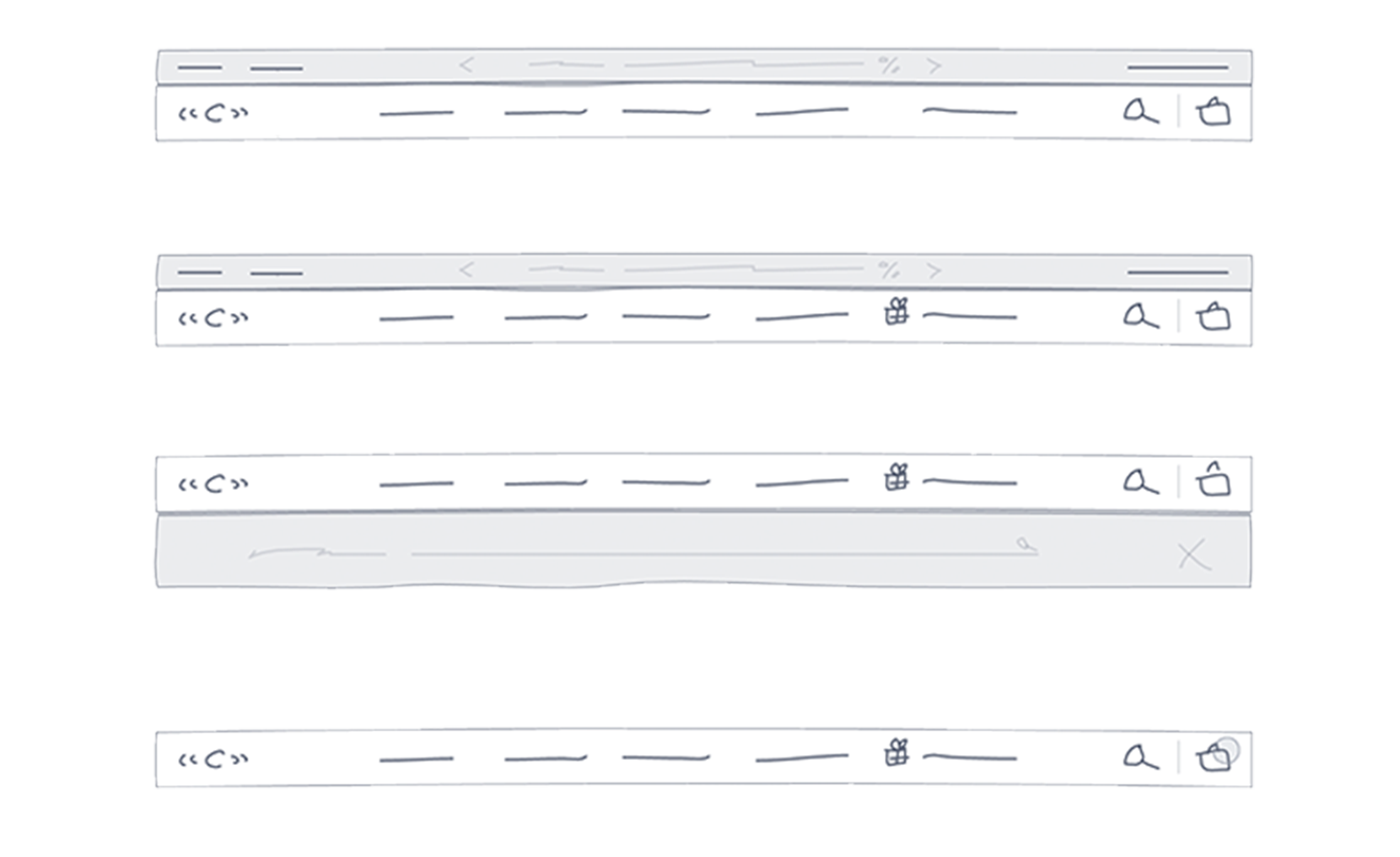
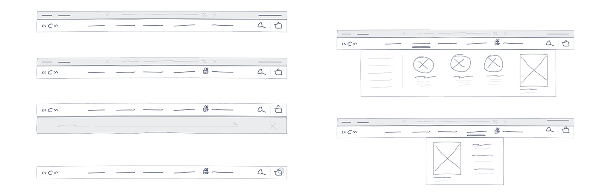
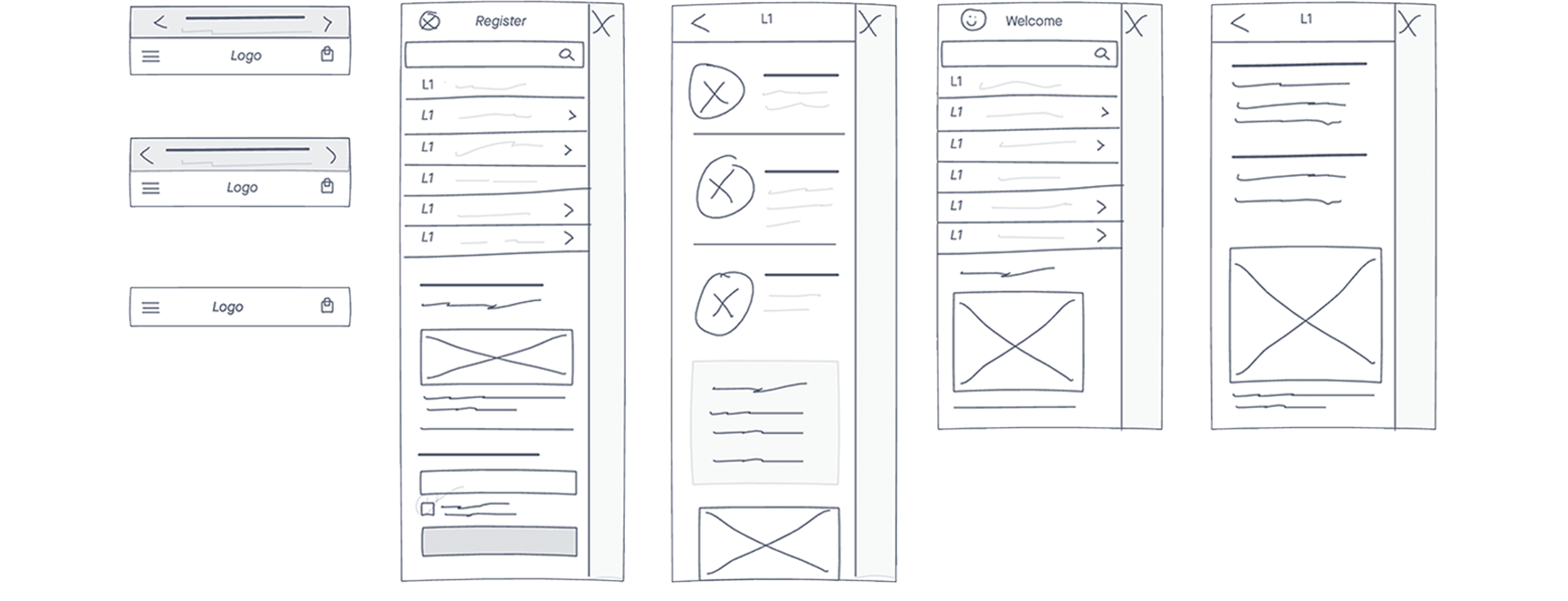
Lofi wireframes and prototypes.
I proceeded with market analysis so that we could explore visual ideas. Cross-functional discussion helped level set design, motion, and flow intention.
I researched ecommerce menus, from both apparel and skincare commerce sites. Captureing a good mix of information architecture from similar industries. I documented common ui elements and micro interactions that would support discussions at the next stage.

With the framework established and the build moving forward. I worked with our development partners to ensure design intention was reflected in the final product.
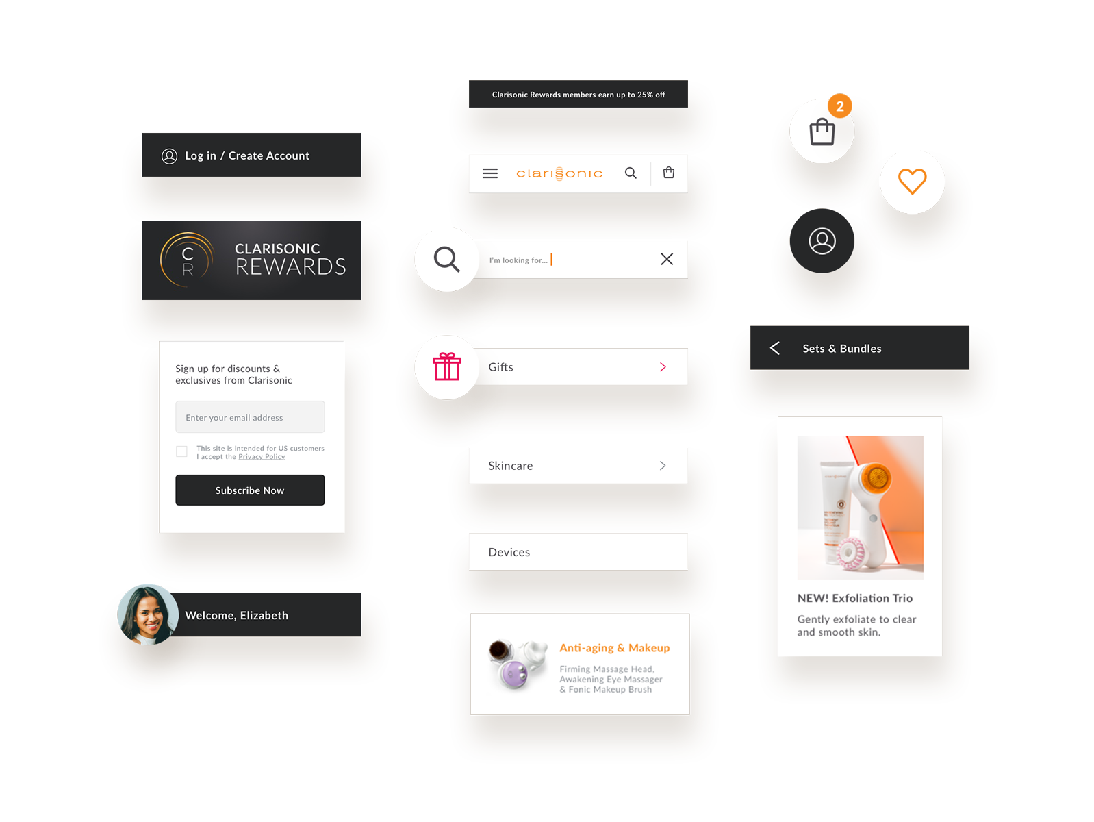
As the sole designer, I needed to work efficiently as I was responsible for both delivery of visual design and art direction of content. My approach to designing the menu was treating it as a sum of many components. This allowed me to work efficiently, while reducing opportunities for inconsistency.
The final product was launched and A/B tested during a high-traffic period. With the redesigned menu, we found an increase in menu engagement and product detail page views.
Visual design and interaction updates were well received. When tested against the original menu, users noted an overall better experience. I was pleased that the subtle interactions and design changes played a large role in this.
Recap.
Restructure of information architecture and removal of redundancies.
Establish product guidance vs. product name-driven mega nav.
Redesign visual language and increase visual cues to help guide users. Improved interaction experience.